

jApple Music is a music and video streaming service developed by Apple Inc. Users select music to stream to their device on-demand, or they can listen to existing, curated playlists. The service was announced on June 8, 2015, and launched on June 30, 2015 in over 100 countries worldwide. Executive Jimmy Iovine has stated that the intention for the service is to become a “cultural platform”, and Apple reportedly wants the service to be a “one-stop shop for pop culture”.
For this study, I focused on three main problems I discovered with Apple Music and sought evidence to support my theories through contextual inquiry, surveying and interviewing users.
LESS ISSUES THAN VOGUE
1. Use of metaphors in iconography
2. Hierarchy of navigation
3. Discoverability of common tasks
THE USERS
As of September, 2018, Apple Music had approximately 19% market share according to Midia. Due to its popularity, it was not difficult to find users.
I asked around in my different social circles to find who uses Apple Music for their main source of music streaming and recruited four people to survey. I found that all of these users fell into one of three user roles.
THERE ARE THREE TYPES OF PEOPLE
1. Alex is a passive user:
He uses Apple Music passively, mainly listening to radio and curated content. He does not want to dedicate time or effort into building a personal library.
He uses Apple Music passively, mainly listening to radio and curated content. He does not want to dedicate time or effort into building a personal library.
2. Manny is an aficionado user:
He uses Apple Music to curate his own personal music library, discover new artists and music by artists he follows, makes and listens to playlists.
He uses Apple Music to curate his own personal music library, discover new artists and music by artists he follows, makes and listens to playlists.
3. Ashley & Scott are hybrid users:
They use Apple Music for radio, much like the passive user and they periodically add to their library and/or make and listen to playlists.
They use Apple Music for radio, much like the passive user and they periodically add to their library and/or make and listen to playlists.
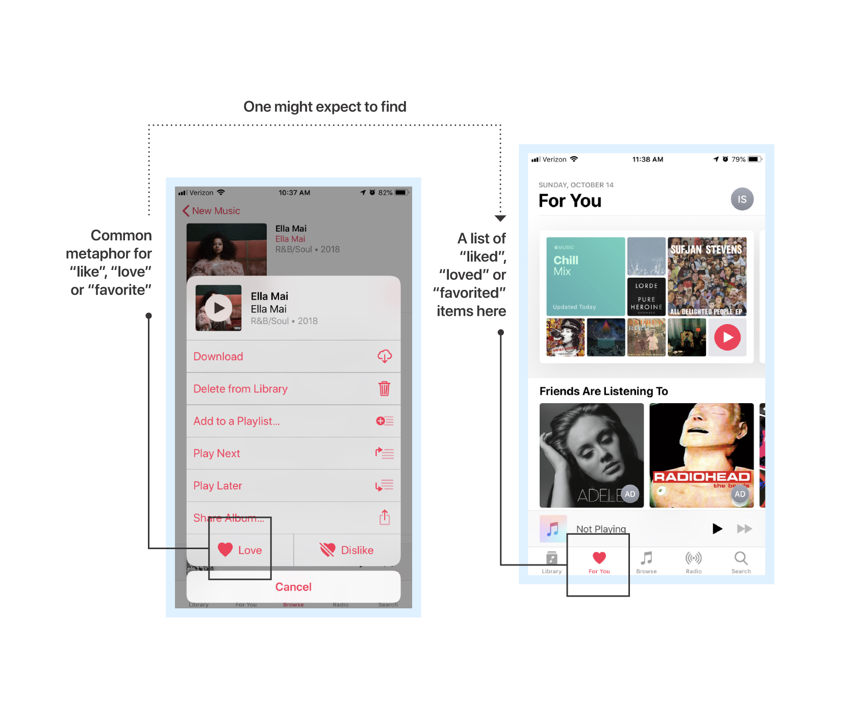
1. USE OF METAPHORS IN ICONOGRAPHY
In analyzing the iconography used in Apple Music, it was noted that there were some inconsistent visual metaphors. One example is Apple’s use of the heart shape as an icon. It is used in the navigation to symbolize “For You” as well as in a button one must use to “Love” a song. The heart shape, in serving two purposes, disrupts the consistency of the visual language used throughout the application.
DO YOU SEE WHAT I SEE?
I sent these questions to my four users in order to gain feedback on the symbols and icons in Apple Music:
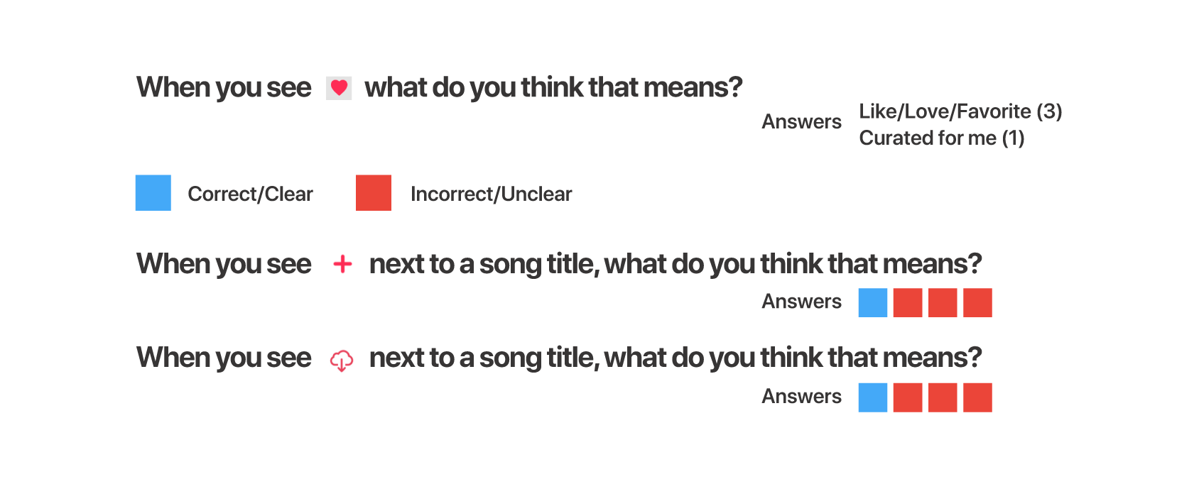
Using “Thinking Aloud” testing, I observed the users engaging with the app in their own environment and took notes.
❝ The (cloud)️ and (heart)️ are a little confusing I don’t know if I’m purchasing a song or borrowing it or saving it or what. ❞
- Manny
- Manny
❝ I am not sure if the cloud means that songs will be downloaded to my icloud account and take up storage. ❞
- Ashley
- Ashley
A SOLUTION
To be an advocate for users means to provide clarity — which enables flow. My goal is to make completing common tasks as seamless as possible for all user types. Employing some simple design changes would provide more clear paths for these processes. Possible options include:
1. Text with icons
Titles can be added adjacent to the icons.
Titles can be added adjacent to the icons.
2. Consistency with icon meanings
The heart shape for the “For You” section can be replaced with something else, making it the universal metaphor for “Love” only.
The heart shape for the “For You” section can be replaced with something else, making it the universal metaphor for “Love” only.
3. Tooltips
Clarifying text could be displayed when a user long presses on the icons.
Clarifying text could be displayed when a user long presses on the icons.
4. Additional icons to indicate status
Additional icons can be added to show the user the status of a song, artist, curated content set, or album. For example, the cloud icon can change into a checkmark next to the tracks that have already been downloaded to indicate it to the user.
Additional icons can be added to show the user the status of a song, artist, curated content set, or album. For example, the cloud icon can change into a checkmark next to the tracks that have already been downloaded to indicate it to the user.
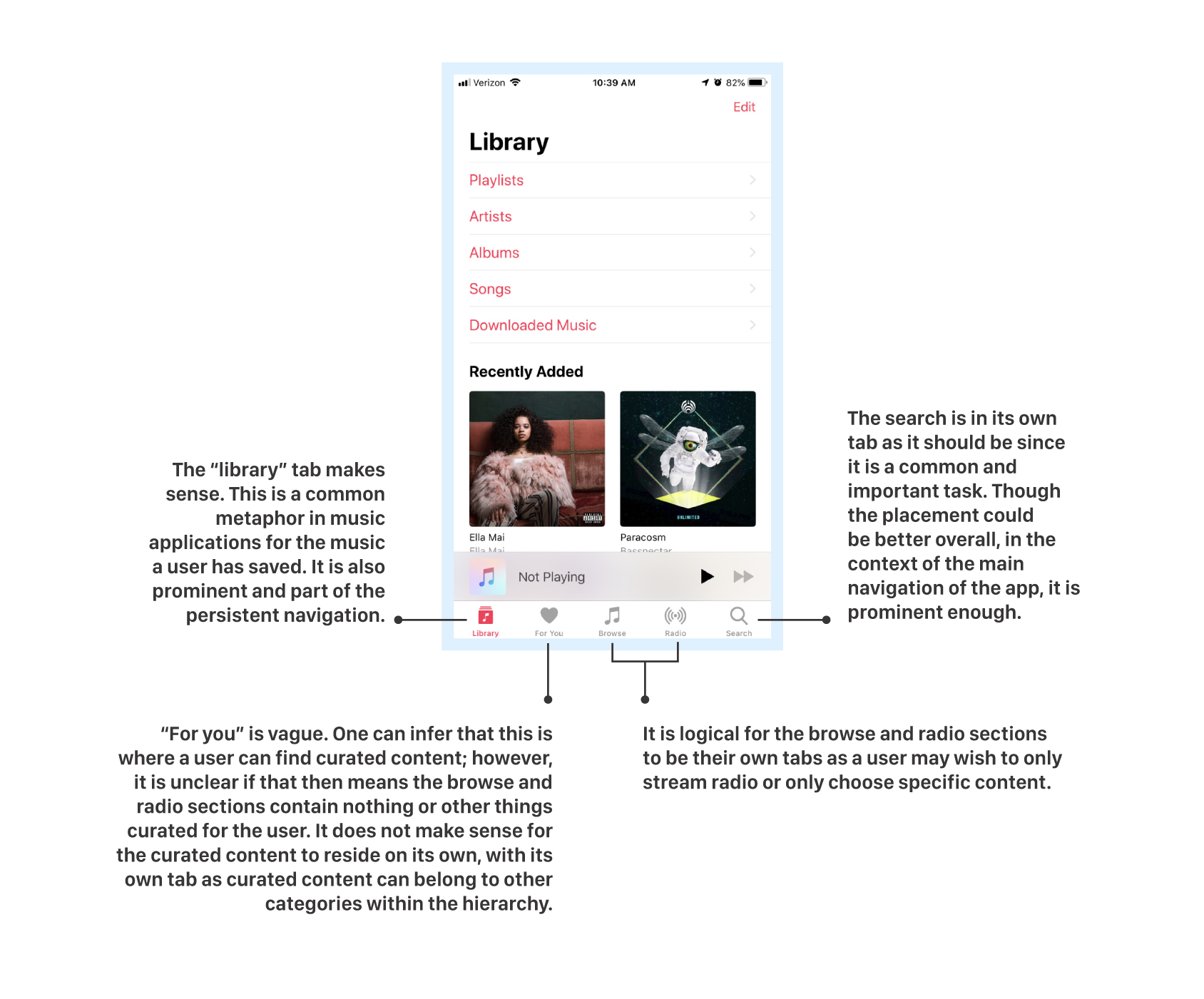
2. HIERARCHY OF NAVIGATION
There are five choices in the main navigation at the bottom of the screen: library, for you, browse, radio, and search.
OPERATION ORGANIZATION
Through video chat and in person interviews, these are some questions I posed to the users in order to gain feedback on the hierarchical structure of the navigation and to gain insight into how they went about completing these tasks that rely on that structure. I also asked for them to give additional feedback aloud as they were able to think of it.
Where would you go to find curated content from influencers or other users?
Where would you go to find newly released music from artists you are interested in?
What type of content are you expecting to find when you tap on “for you”?
What type of content are you expecting to find when you tap on “browse”?
How would you go about finding and playing an artist’s most popular song?
❝ I do enjoy the ‘new music’ section to see which artists are coming out with new stuff.There should be an option to list music I like and then give me notifications something new comes out. ❞
- Scott
- Scott
A SOLUTION
Users did not come to a consensus about where to find content based on their own preferences or content curated by Apple Music, regardless of specific music preferences. Users also hesitated to find the newest music released by specific artists they like.
1. Remove “For You” tab
This section can be removed from the main navigation and reside within the “Browse” tab. It would be its own category within “Browse” as that is where a user browses for content and “For You” is a type of content to be perused.
This section can be removed from the main navigation and reside within the “Browse” tab. It would be its own category within “Browse” as that is where a user browses for content and “For You” is a type of content to be perused.
2. Create categories within “Browse” tab
The “Browse” section can contain clear headings with categories such as “For You”, “New on Apple Music”, “Curated Content:, etc.
The “Browse” section can contain clear headings with categories such as “For You”, “New on Apple Music”, “Curated Content:, etc.
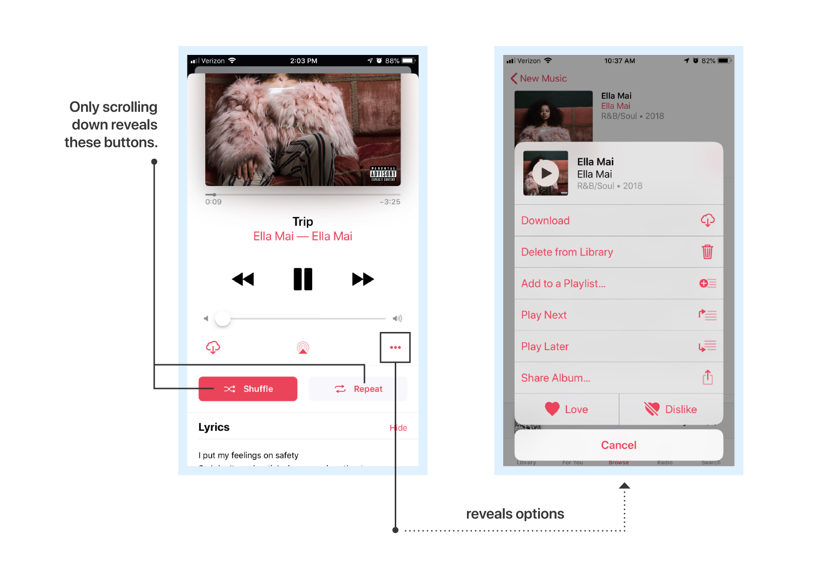
3. DISCOVERABILITY OF COMMON TASKS
The way to complete very common tasks within an individual playing song can be convoluted or difficult to discover. Commonly, competitor apps and music players will have a direct, one click/tap way to toggle shuffle, toggle repeat, like the song, and dislike the song. In Apple Music, the user must tap on a small options menu from the full screen view of the playing song in order to like or dislike the song. To repeat or shuffle on an individual song, the user must scroll down; however, there is no indication that a user should.
TAKING IT TO TASK
Under observation, I asked the users to perform common tasks such as:
Search for an artist and shuffle through their top 10 most popular songs in no particular order.
Find a particular song and set it to repeat.
Search for and play an individual song. Toggle on Shuffle. ”Like” the song. Find the song you just “liked” listed within your own content.
Play an album. Create a radio station based on that album or artist.
What I found was that the users recalled how to perform certain tasks, within certain screens; however, the way to do those same tasks from different screens change, disrupting the user’s flow and lowering their confidence. Implementing more consistency could help. I also found that most users did not know how to set a song to repeat or shuffle (expressed aloud) or, if they did, it took them some time to find it.
❝ I like to create stations based on artists, songs, and albums I like. It’s easy to create a station based on an artist but I don’t see the option for an album. ❞
- Alex
- Alex
A SOLUTION
Users did not come to a consensus about where to find content based on their own preferences or content curated by Apple Music, regardless of specific music preferences. Users also hesitated to find the newest music released by specific artists they like.
1. Make room for buttons by removing others
Screen real estate is at a premium on mobile devices. By removing redundant UI elements and making others more prominent, common tasks become easier. For example, the volume control could be removed from the player screen and be replaced with shuffle and repeat buttons “above the fold”. Volume could be controlled with the physical buttons on the side of the user’s device. The Airplay button could also be removed as this is available on the device’s control panel already and that would create space for “like” and “dislike” icons.
Screen real estate is at a premium on mobile devices. By removing redundant UI elements and making others more prominent, common tasks become easier. For example, the volume control could be removed from the player screen and be replaced with shuffle and repeat buttons “above the fold”. Volume could be controlled with the physical buttons on the side of the user’s device. The Airplay button could also be removed as this is available on the device’s control panel already and that would create space for “like” and “dislike” icons.
2. Clearly indicate scrollability
A small arrow or other indicator could be placed at the bottom of the player to encourage the user to scroll and discover additional UI for completing the common tasks.
A small arrow or other indicator could be placed at the bottom of the player to encourage the user to scroll and discover additional UI for completing the common tasks.
3. Create additional ways to do the same tasks
The common tasks of shuffling, repeating, liking, and disliking songs could also be accessible via the contextual menu as a redundancy, making it more visible all around.
The common tasks of shuffling, repeating, liking, and disliking songs could also be accessible via the contextual menu as a redundancy, making it more visible all around.
IN SUMMARY
Through research and contextual inquiry, I was able to confirm my suspicions about some of the usability issues with Apple Music on iOS. For the aficionado user, I discovered that the learning curve is steep when they wish to deeply engage with the content. For the passive user, the tasks are very basic and the problems affect them less; however, they are able to see and acknowledge some issues that do exist. For the hybrid user, usability issues affect their ability to deeply engage with the content but they do not wish to invest extra time into learning how to. If the experience was more intuitive, these hybrid users may convert to aficionados.
With a few minor revisions to the user interface, the overall experience could be vastly improved. The application has a lot of potential to overtake Spotify as the market leader for music streaming services.