

What is Flexjobs?
Flexjobs is a job board for vetted remote and flexible work opportunities. The website is subscription-based, paid by the job seekers. Job seekers are the users in this case study.
what seems to be the problem here?
—
The Issues
There are three main issues I wanted to tackle with the UX of flexjobs.com:
1.
Everything but the kitchen sink
Cluttered and crowded pages.
Everything but the kitchen sink
Cluttered and crowded pages.
2.
Searching for the search
The main task (simply find a job) is not prominent.
Searching for the search
The main task (simply find a job) is not prominent.
3.
just tell me what i have to pay
The pricing information is small and tucked away.
just tell me what i have to pay
The pricing information is small and tucked away.
who are you when you’re at home?
—
The Users
Flexjobs users are job seekers. The users are either non-members, doing research, using Flexjobs as a resource or they are paying members, actively seeking remote job leads.
1.
Digital Nomads & tech-centric professionals
• Millennial & Gen X age
• Desire a better work-life balance, flexibility
to travel or flexibility to remain at home for
lifestyle reasons, and no commute.
Digital Nomads & tech-centric professionals
• Millennial & Gen X age
• Desire a better work-life balance, flexibility
to travel or flexibility to remain at home for
lifestyle reasons, and no commute.

“Digital Nomads are individuals that leverage technology in
order to work remotely and live an independent and nomadic lifestyle.” [1]
order to work remotely and live an independent and nomadic lifestyle.” [1]
“FlexJobs survey finds top companies for millennials to consider
when looking for work-life balance” [2]
when looking for work-life balance” [2]
2.
Moms-to-be, parents, family caretakers
Moms-to-be, parents, family caretakers

3.
Disabled or unfit for conventional work
Disabled or unfit for conventional work
everything but the kitchen sink
—
1.
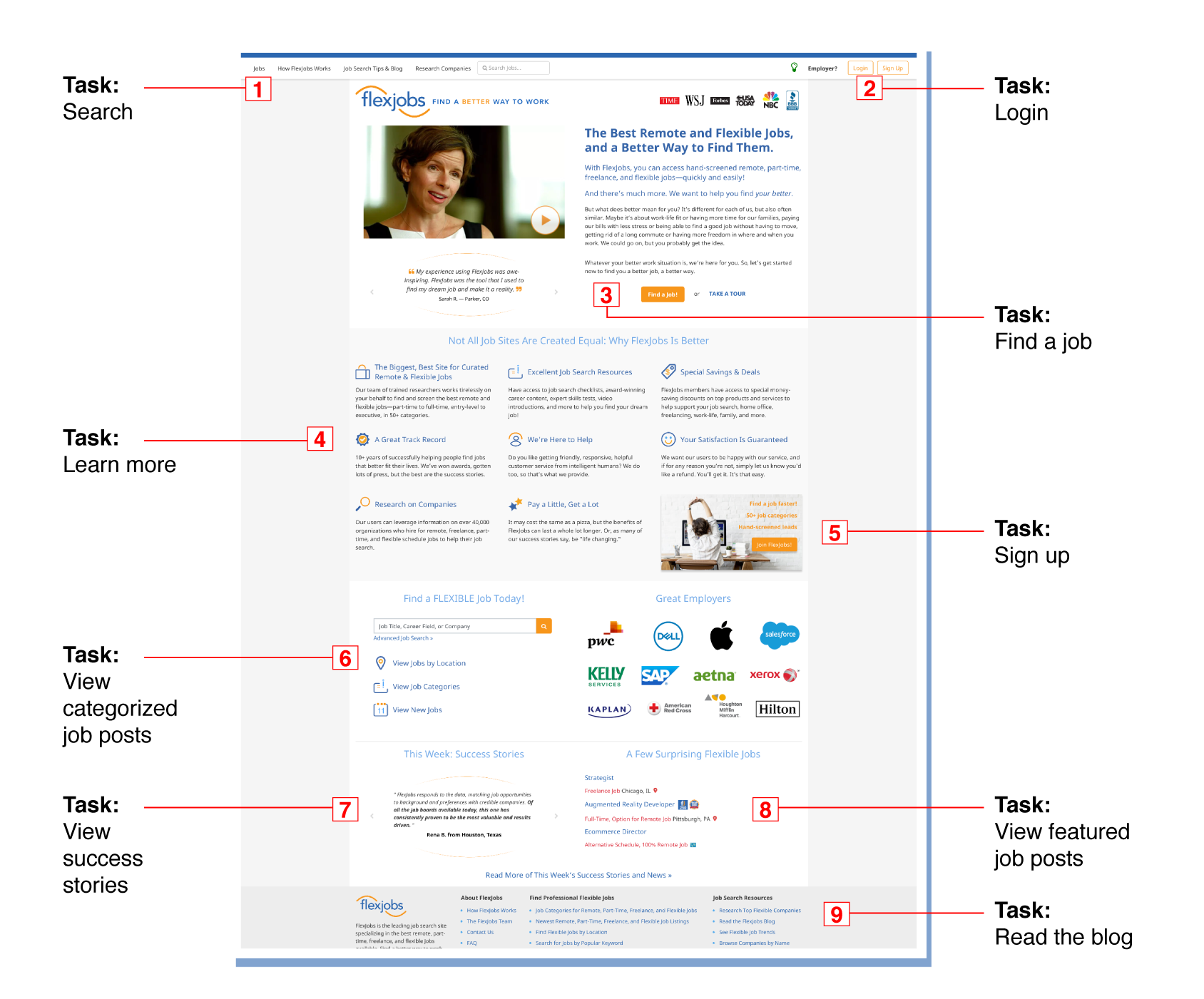
There are nine main task areas with many repeated links but no consistent naming conventions.
Several UI elements are anti-patterns.
Hierarchy is unclear.
Proof? Meet pudding
User comments
Users specifically mention the user interface and the overall experience.
“I can’t pretend I’m a fan of the interface and dashboard. It looks pretty old school, and cleaner designs are more the norm these days.”

“Despite a wealth of searching and filtering options, the way the jobs are presented is all a bit of a muddle...”
“There’s a huge amount of blog content on the site,... The “cluttered” theme does continue here though, making browsing this (quite decent) content more of a struggle that(sic) it needs to be.”
a place for every thing &
every thing in its place
every thing in its place
A Solution
There are a few solutions to the problem of a clunky experience:
1.
Create one higher level
By creating a higher level of navigation, with few general categories within which the plethora of information could live, the user will be able to choose their path and get introduced to the content at their own pace and according to their needs.
Create one higher level
By creating a higher level of navigation, with few general categories within which the plethora of information could live, the user will be able to choose their path and get introduced to the content at their own pace and according to their needs.
2.
consistent titles & naming conventions
By streamlining the language used in calls-to-action, titles, and tips throughout, users
will be able to clearly understand that any redundancies are intentional and for the
users’ own convenience.
consistent titles & naming conventions
By streamlining the language used in calls-to-action, titles, and tips throughout, users
will be able to clearly understand that any redundancies are intentional and for the
users’ own convenience.
3.
cleaner graphics and visual metaphors
Simplifying some of the graphics used throughout will visually clean up the space. One color icons can be used instead of colorful badges to indicate job features. Icons can be eliminated from the sidebar menu as these are redundant links.
cleaner graphics and visual metaphors
Simplifying some of the graphics used throughout will visually clean up the space. One color icons can be used instead of colorful badges to indicate job features. Icons can be eliminated from the sidebar menu as these are redundant links.
Searching for the search
—
2.
Being that it is a job search website, for job seekers, a search bar that users have become accustomed to seeing on the web is not prominent enough. Copy is inconsistent.
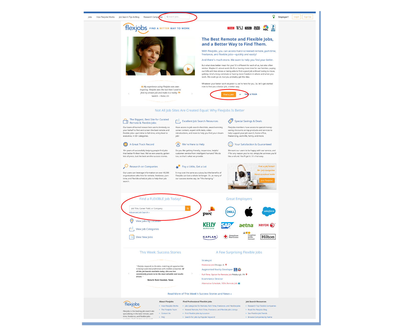
why are you here?
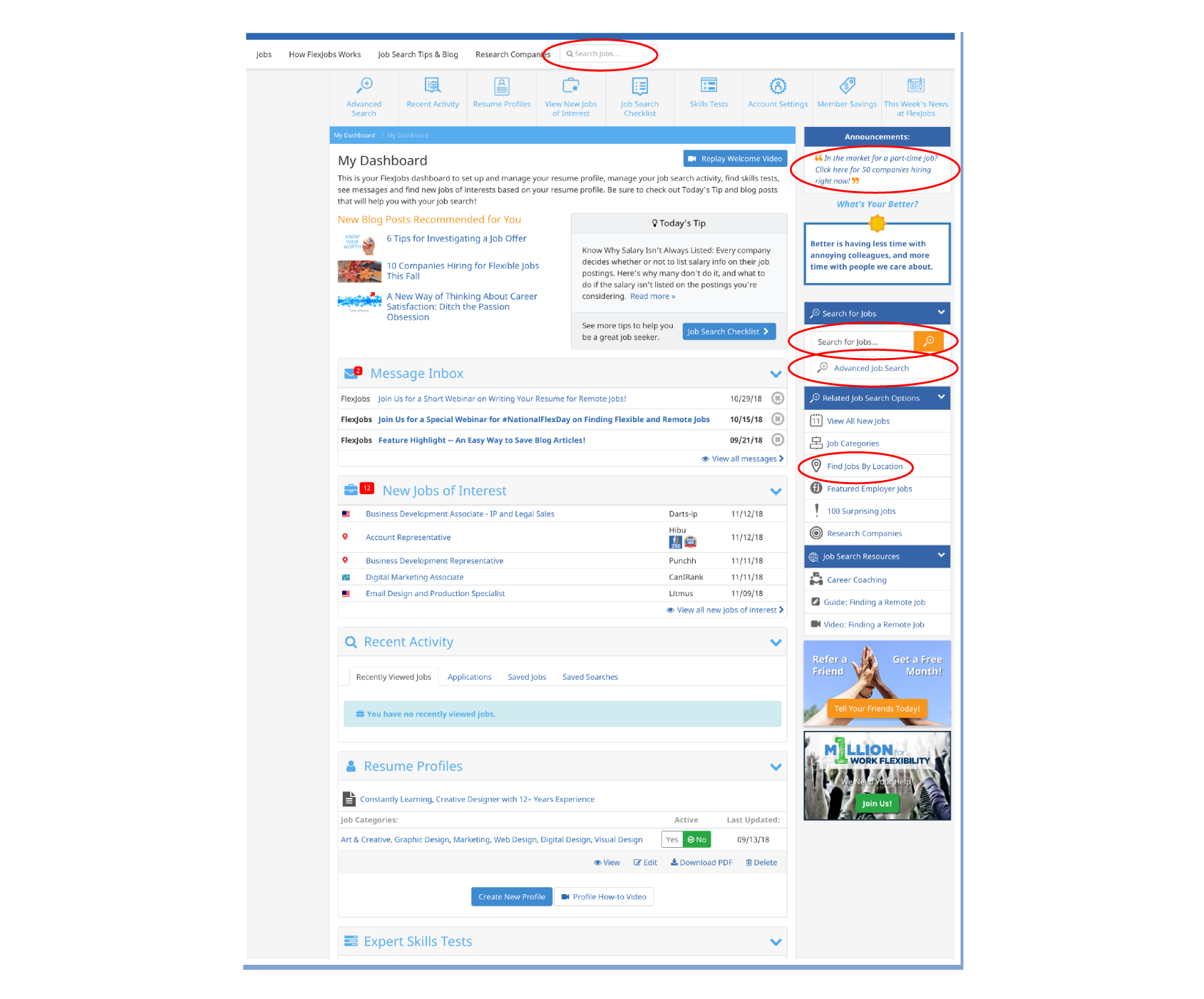
Once a user becomes a paid subscriber, and is given access to their personal dashboard, the search process does not simplify. A number of features become available while still inundating the user with the same promotions and resources as the free, public-facing site.
A Hierarchical Task Inventory audit revealed that approximately
40 different tasks
(plus some redundant)
are available to the user on the dashboard.
There are several different ways to find jobs through categorization and other criteria.
40 different tasks
(plus some redundant)
are available to the user on the dashboard.
There are several different ways to find jobs through categorization and other criteria.
Search Lost & found
A Solution
Solving the issue of a search bar hidden in plain site is simple:
1.
take a cue from google
Revamp the search process to start simply and get more detailed with sorting and filtering as the user dives deeper (if needed).
take a cue from google
Revamp the search process to start simply and get more detailed with sorting and filtering as the user dives deeper (if needed).
2.
make it bigger, bolder, brighter
Use power colors, larger, bolder type and bigger shapes to make the search bar stand out.
Center the search bar to make it the focal point.
make it bigger, bolder, brighter
Use power colors, larger, bolder type and bigger shapes to make the search bar stand out.
Center the search bar to make it the focal point.
just tell me how much to pay
—
3.
Flexjobs is a paid subscription service and that fact is not made clear throughout the site. Because pricing is not disclosed in a prominent and transparent manner, it may result in
loss of sales.
loss of sales.
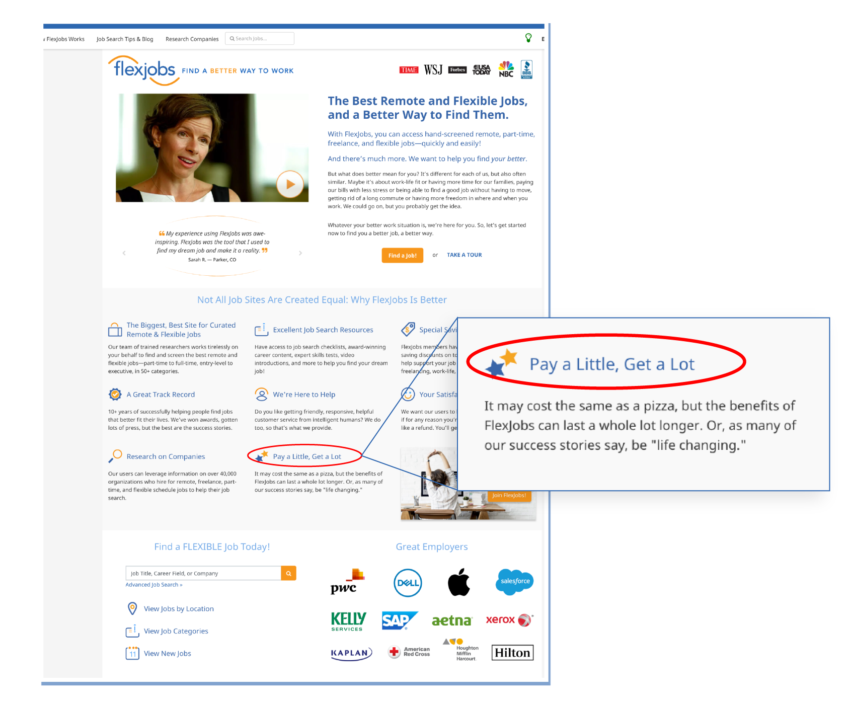
The only mention of paying is over halfway down the page, buried within the copy.
It does not disclose the amount upfront, only that it may
“cost the same as a pizza”.
The icons used in this section are not related to money, creating a confusing and,
possibly even misleading, metaphor.
possibly even misleading, metaphor.
I saw the $ sign
The current approach is meant to be an enticement but comes off more like
a bait and switch tactic.
a bait and switch tactic.
“The site showed many promising telecommuting jobs. However, not telling visitor about the fee until they are hooked seems sneaky.”
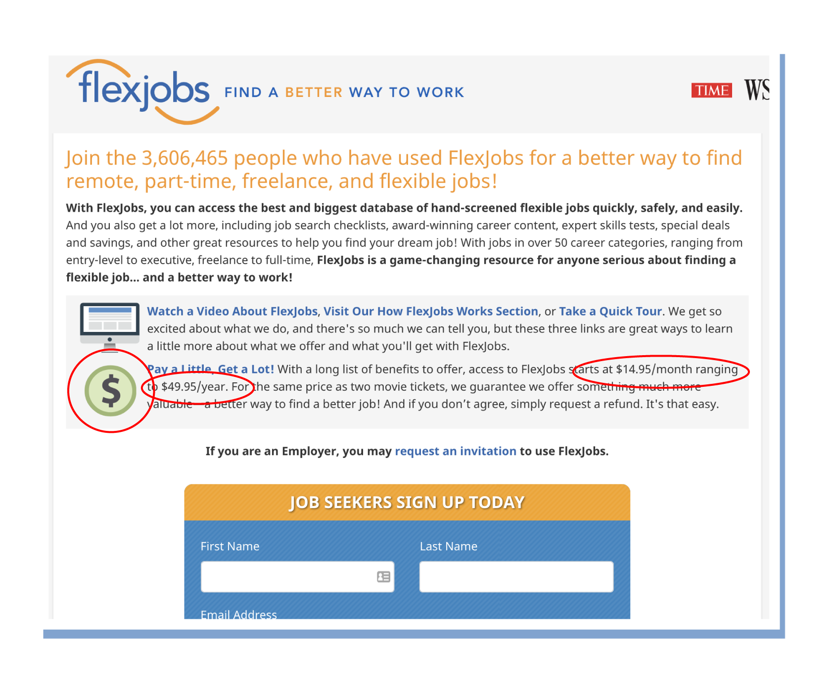
The first dollar sign is seen on the first page of the registration process; however,
it is small and integrated into a paragraph of copy.
Even here, it only discloses a price range, not a complete breakdown.
it is small and integrated into a paragraph of copy.
Even here, it only discloses a price range, not a complete breakdown.
become captain obvious
A Solution
There are simple ways to address the issue of when/where/how
to disclose pricing information:
to disclose pricing information:
1.
put it on the menu
Add a tab or menu item to the main navigation, which is persistent throughout the site: “Pricing”, “Subscription Plans”, “Pricing Tiers”. These pages would detail the cost first and foremost and, secondly, what the user gets for each price.
put it on the menu
Add a tab or menu item to the main navigation, which is persistent throughout the site: “Pricing”, “Subscription Plans”, “Pricing Tiers”. These pages would detail the cost first and foremost and, secondly, what the user gets for each price.
2.
Add the lowest price to the cta’s
There are many promotions and calls-to-action throughout the site to entice users to sign up. By adding copy that includes the lowest cost option (“Starting at just $14.99/mo. for unlimited access...”), the minimum spend would be clear and users would be less likely to abandon the signup process due to misunderstandings about cost.
flexjobs ux
—
Conclusion
Flexjobs is chock full of useful information, the movement behind remote work and the intentions of the website are noble.
Though Flexjobs users may lean more tech-savvy than average,
it does not mean they should have to work harder to find what they seek.
it does not mean they should have to work harder to find what they seek.
With just a few simple changes, the experience could go from a great resource with a steep learning curve, to a great resource for any job seeker.
The Design Solutions

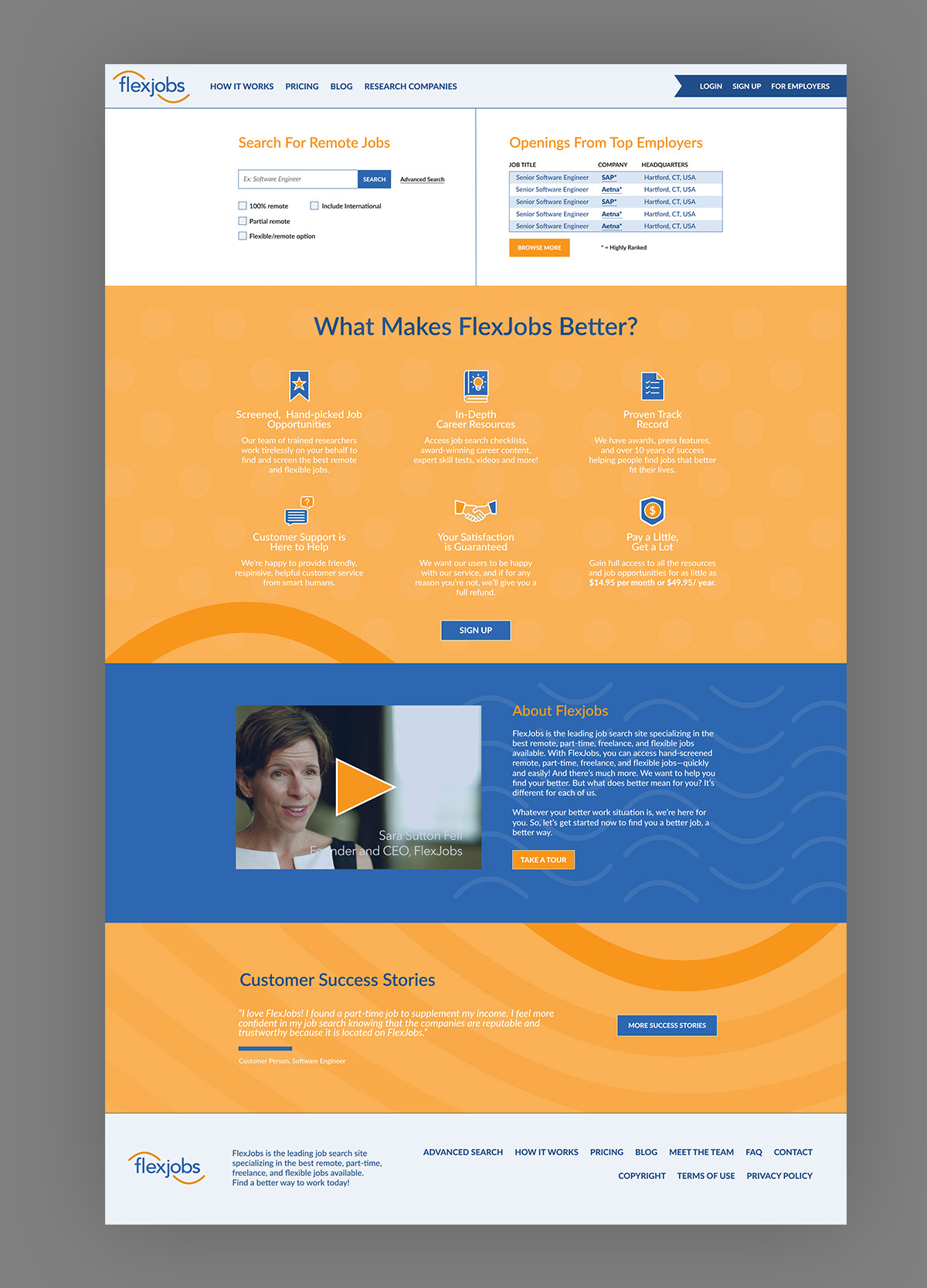
Home Page
Upon visiting flexjobs.com, the user will be able to easily begin the task of searching for a job, based on his or her own parameters, learn more about what Flexjobs has to offer, how much it costs, and how to sign up. The home page has been reorganized to prioritize a direct job search, similar to other popular job search websites.
Upon visiting flexjobs.com, the user will be able to easily begin the task of searching for a job, based on his or her own parameters, learn more about what Flexjobs has to offer, how much it costs, and how to sign up. The home page has been reorganized to prioritize a direct job search, similar to other popular job search websites.
The user’s journey will begin by experiencing some of what the website has to offer for free, before they need to subscribe and pay. However, the pricing information is now disclosed on this front page. There are two columns — one for searching by typing in a specific query and one for browsing by job openings by the top companies. Searching by the top companies is a priority because Flexjobs emphasizes that the opportunities listed on the website are all legitimate, hand-selected job postings. Next, there are some short blurbs of information, illustrating the benefits and basics of using Flexjobs. These are not links, it is meant to be an overview only. There is a call-to-action immediately following this information. This is meant to prompt the user to make the decision to sign up, after having looked over the benefits.
The video from the current home page is present in the redesign but it is moved further down, below the main tasks. Below the more detailed “About” section is a featured testimonials slider module that also provides a direct link to the full “Success Stories” page.
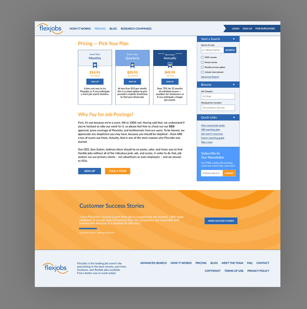
Pricing Page
This page discloses all of the pricing tiers upfront, showing transparency. This page can now be accessed from the main navigation, rather than buried several steps into the sign up process. The information has been flipped so that the numbers are front and center and the justification for paying these amounts are immediately below. There are several calls-to-action to make signing up quick and easy once the user decides he can afford the prices.
This page discloses all of the pricing tiers upfront, showing transparency. This page can now be accessed from the main navigation, rather than buried several steps into the sign up process. The information has been flipped so that the numbers are front and center and the justification for paying these amounts are immediately below. There are several calls-to-action to make signing up quick and easy once the user decides he can afford the prices.
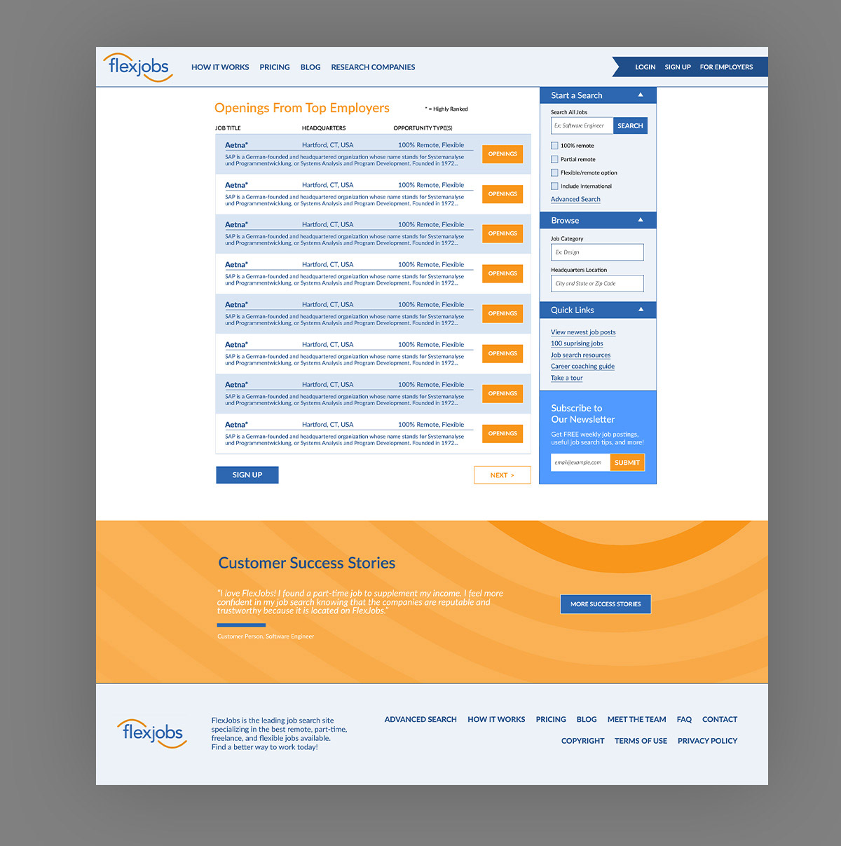
Top Employers Page
This page holds a list of the top employers that have been vetted by Flexjobs and offer flexible and/or remote work opportunities. Rather than displaying many badges next to each employer to show every one of their accolades, an asterisk is displayed next to employers that meet a certain level of prestige. More in-depth information about how these employers rank, should be on another page, cleaning the list up for the user to scan without as much visual noise while still disclosing the information for those interested.
This page holds a list of the top employers that have been vetted by Flexjobs and offer flexible and/or remote work opportunities. Rather than displaying many badges next to each employer to show every one of their accolades, an asterisk is displayed next to employers that meet a certain level of prestige. More in-depth information about how these employers rank, should be on another page, cleaning the list up for the user to scan without as much visual noise while still disclosing the information for those interested.